
Knowledge Center
Knowledge Center
Knowledge Center
Redesigning Ventura's IPO experience to help users navigate financial decisions with greater clarity and confidence
Redesigning Ventura's IPO experience to help users navigate financial decisions with greater clarity and confidence
Redesigning Ventura's IPO experience to help users navigate financial decisions with greater clarity and confidence
Industry
Industry
FinTech
FinTech
Timeline
Timeline
3 weeks
3 weeks
My Role
My Role
My role as a Product Design Intern was heavily focused on visuals, from creating engaging motion designs and animations to redesigning existing flows in line with Ventura’s new design system. I also worked on introducing new features aimed at enhancing user engagement and making the app more intuitive and visually appealing.
Interviews with students and teachers revealed a common challenge: navigation barriers hindering accessibility, making it difficult to find crucial academic resources efficiently.
After understanding the IPO process, I moved on to designing the UI with subtle UX tweaks to simplify navigation, enhance clarity, and make the experience more intuitive for users
Knowledge Center
Knowledge Center
The Knowledge Center was created as a concept design to explore how Ventura could make financial learning more engaging. Since the team was working on developing a detailed course series called Beyond Basics, I used the existing Bazaar Basics videos as placeholders while designing the overall learning flow. Along the way, I also explored visual direction and layout ideas wherever possible, helping shape how the learning experience could feel visually cohesive and user-friendly.
Research Overview
Research Overview
Discussing with the Content Team
Discussing with the Content Team
I spoke with the team creating the course content to understand the structure of their videos, the learning objectives, and the ideal flow they envisioned for users.
I spoke with the team creating the course content to understand the structure of their videos, the learning objectives, and the ideal flow they envisioned for users.
Understanding Gamification in Finance
Understanding Gamification in Finance
I researched gamification models used in financial learning platforms to understand what motivates users and what methods actually enhance retention.
I researched gamification models used in financial learning platforms to understand what motivates users and what methods actually enhance retention.
Analyzing User Learning Behavior
Analyzing User Learning Behavior
I studied how beginner-level users typically consume educational content, attention spans, preferred formats, and common drop-off points to ensure the experience remained simple, engaging, and not overwhelming.
I studied how beginner-level users typically consume educational content, attention spans, preferred formats, and common drop-off points to ensure the experience remained simple, engaging, and not overwhelming.
Brainstorming
Brainstorming
During the ideation phase, I explored and tested different gamification approaches to understand what could work best for Ventura’s learning experience. I looked into gamification options, quizzes emerged as the strongest choice. They were simple, effective, and aligned well with the educational goal of reinforcing concepts immediately after each video.
During the ideation phase, I explored and tested different gamification approaches to understand what could work best for Ventura’s learning experience. I looked into gamification options, quizzes emerged as the strongest choice. They were simple, effective, and aligned well with the educational goal of reinforcing concepts immediately after each video.
Information Architecture
Information Architecture
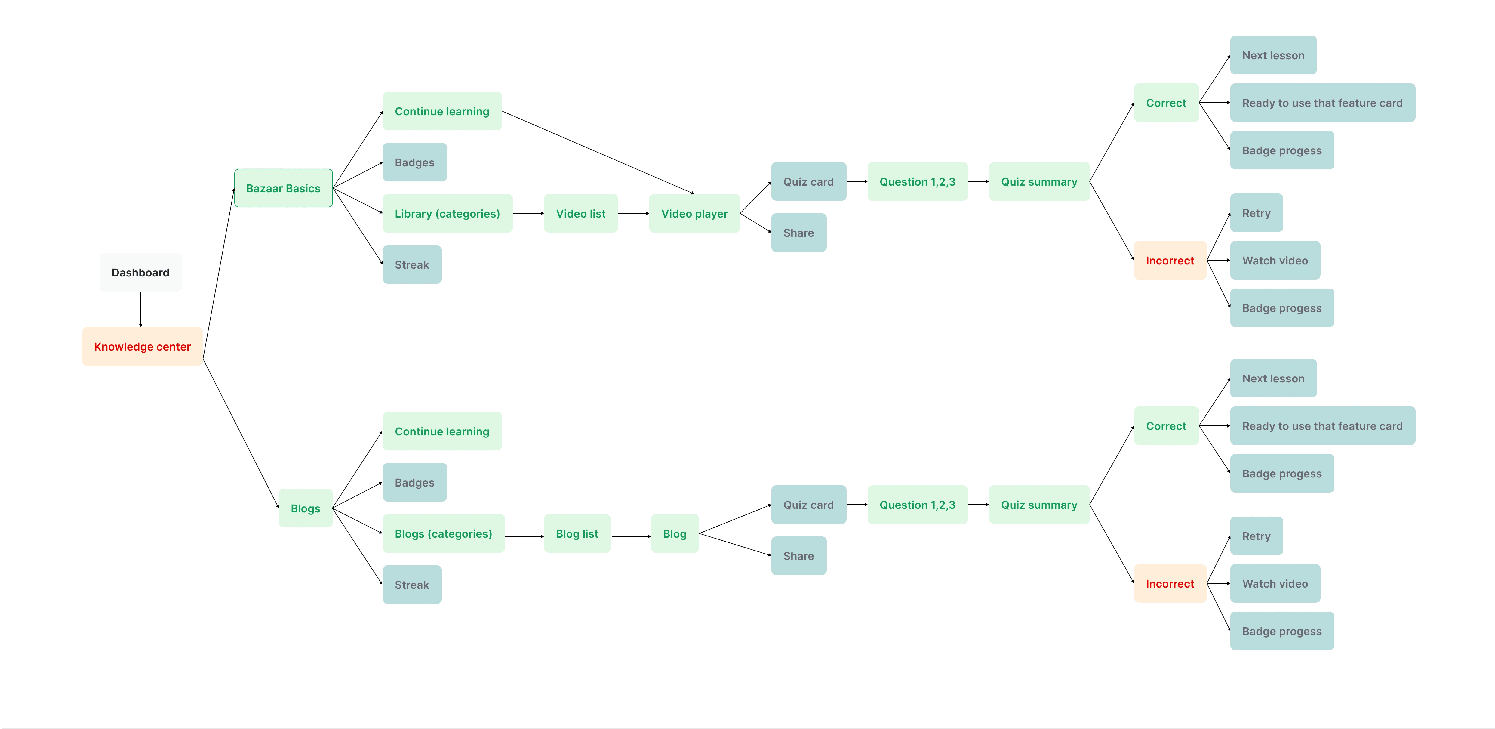
To stay aligned with the overall experience I wanted to build, I first mapped out a simple screen flow. This helped me visualize the user journey end-to-end, identify the key interaction points, and plan how each screen would connect before moving into detailed design.
To stay aligned with the overall experience I wanted to build, I first mapped out a simple screen flow. This helped me visualize the user journey end-to-end, identify the key interaction points, and plan how each screen would connect before moving into detailed design.
Screen Flow- Hi-Fidelity Wireframes
Screen Flow- Hi-Fidelity Wireframes
